THE HISTORY OF
KOPPARTRANS
In times immermorial - 1947 to be precise - Transatlantic, the shipping company, joined with mammoth mining corporation Stora Kopparberg (est.1288) to found an oil- and gascompany whose name was to be a combination of that of the two parent companies: Koppartrans.
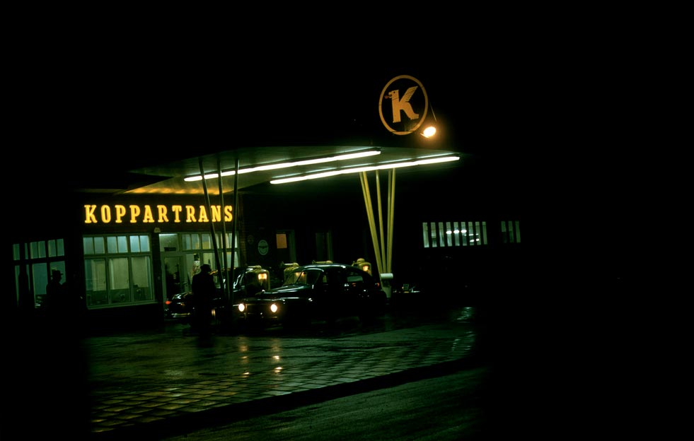
By means of a big freighter, 4851 pieces of cargo were transferred from the United States to Gothenburg in order to construct the largest refinery in Sweden. The site, finished in September 1949 and featuring some 50 cisterns and 100 kilometers of pipelines with a capacity of 200,000 cubic meters of oil, was inagurated with all due pomp and circumstance. The person given the honorary task of lighting the perpetual flame from surplus gas was R. Ljunglöf, the snuff magnate. The red tounge in the Koppartrans logo symbolizes this flame. The capital K with the fire-spewing lion became one of the most widely disseminated and visible logos in the country during the 1950s and 60s, seen in the country where Koppartrans Gas stations were established. In 1959, half of the company was purchased by Shell Oil and four years later they took over the entire operation. In the early 1970's Shell dissolved Koppartrans.
25 years later, the name and logo were taken over by the clothing designer Per-Eric Melinder. In the spring of 1998 he had finished his first collection. The line was, to a great extent, inspired by the kind of clothing worn by gas station personnel during the 1950's and 60's: The collections soon changed into amore minimalistic refined design and it's still rolling.
the watch
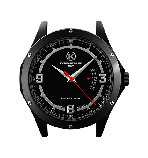
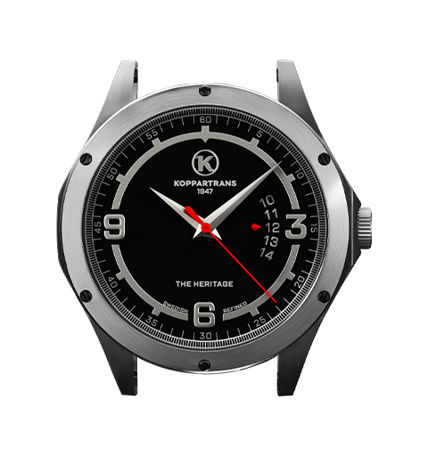
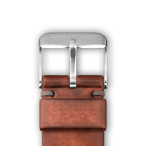
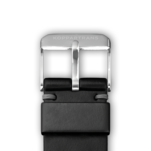
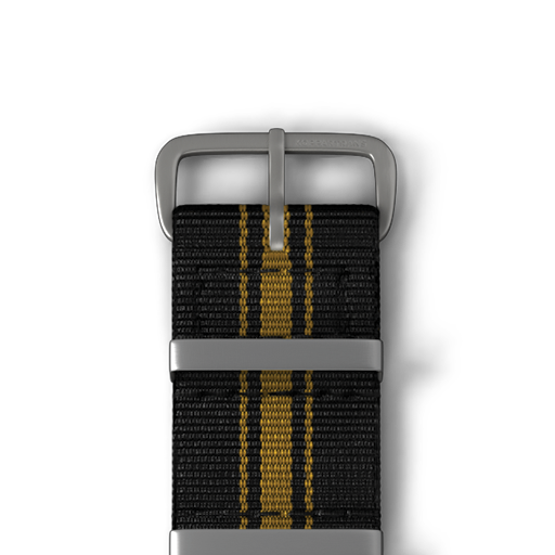
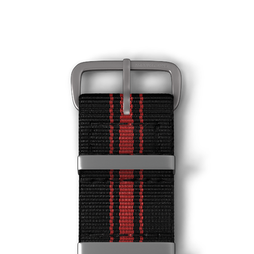
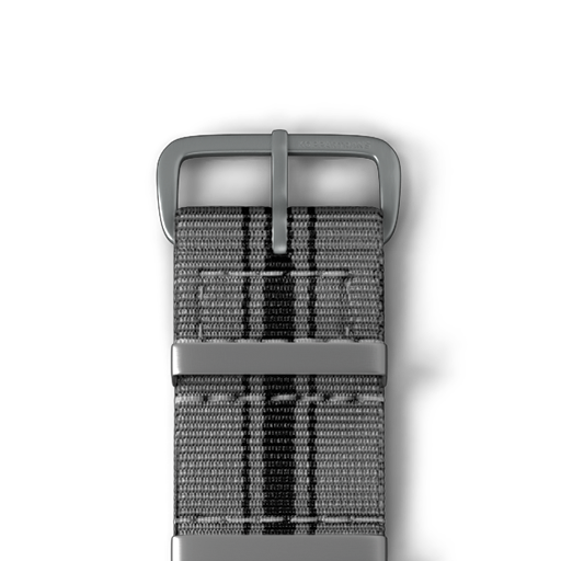
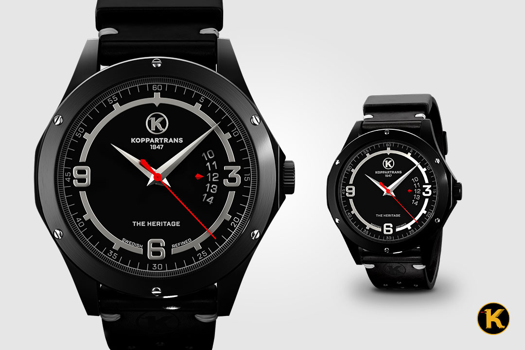
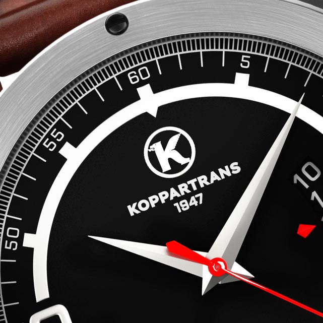
After another two decades Per-Eric Melinder and former industrial CEO Per Nilsson started to develop the Koppartrans watch concept. Design and inspiration were found within our heritage from motors and racing. The powerful logo has been transformed into the dial of the watch. The circle in the dial has been adjusted to give space for the figures 3, 6 and 9. Note that the dates are shown in the unique window shown by the edge of a red arrow symbolizing the red tounge in the Koppartrans logo. The case is inspired by a fuel cap and the rims with it's nut bolts and the capital K adorn the crown. The bracelet is influenced from the motorworld. The distinctive Koppartrans smell remains so to speak. It is an approach that works genealogically rather than thematically, producing unique, encoded pieces rather than examples or representations of some unifying or overarching principle.
Be a part of The History…
follow us